Website Design can make or break a companies online success.
Press release February 16, 2012 YoungGood website design and navigation can be the success to an online business. Would you walk into a shop that was uninviting or isn't clear about what they are selling?

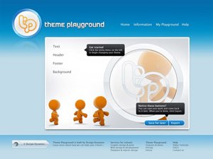
Web surfers are basically a fussy bunch and if they don't like the look or feel of a website they will be off in a click; never to return. So many companies lose potential customers within seconds because their graphic design is dated or cheap and doesn't create a good first impression. Many people forget that their main page is like their shop window; would you walk into a shop that is uninviting or doesn't really display what they are selling? When designing a new website or revamping an existing one, research other websites within the industry or not even relevant to get a good idea of which websites create trust through their look and feel.
Many websites on the market have been over designed with plenty of graphics, pictures and flash. The owners think that it will make the page look more desirable however, most people prefer simple yet attractive. If you are not an enternainment site stay clear as most visitors are looking for information not to be entertained. (Google is a robot, it does not see pictures only content so they do not have impact with rankings on the search results.)
Your opening content should act as your sales pitch:
- Who you are
- What do you do
- Why should a visitor become a customer/member
- Call to action (should be displayed on every page within your website.
Testimonials are a great way to allow customers to read independent reviews of your service, previous customers are a brilliant sales pitch.
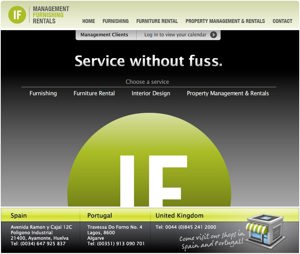
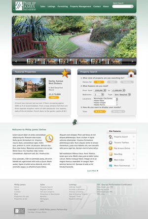
Web surfers are not renowned for their patience; once they have decided that they like the look of a website, if they cannot find what they are looking for quickly and easily they will just click away. A well built site will have effective navigation which, allows the customer to move freely around without any frustrations. Website navigation has to be simple and make sense to the average person. Whilst creativity differs from website to website, the navigation layout on most sites are very similar.
A good website designer will always be mindful of the intended audience and the basic purpose of the website whilst designing the navigation elements. A website is either to provide information, promote a product, sell the product or a service therefore the surfer will want to be able to find what they are looking for easily. Navigation links are usually clearly displayed in menus, sidebars and buttons making them obvious that they are links by changing colour or underlining the text when the mouse is hovered over them. You should never be tempted to use clever names for links as it is just confusing for the customer and gives them another reason to go to your competitors.
Also don't make it an ordeal to get to the end result; a professional website designer will use the "the 3 click rule". Worldwide studies of web surfers show that they will not click more than three times to find the information they are looking for - remember they are an impatient bunch! So each page on your website should be accesible by clicking 3 times.
Navigation Locations
Top Menus – placed at the top of the website page, usually located below the page header and graphic. These items can be single links, expandable or be a header link with a drop down menu.
Left Side Navigation – Usually displayed as a column on the left hand side of the page within the top portion of the webpage. As with the top menu it can be expandable or a single link.
Right Side Navigation – the right side navigation is not used that often, as the rule is to keep it simple and people read from left to right so their information is immediately in front of them. Most designers use this space for advertisements or call to actions.
Bottom Menus – bottom menus are usually a duplicate of the main navigation menu and are basically used as text links for search engines.
Important Navigation Elements
Internal Page Links – Internal page links are good for search engines as they are coded however, they are also good for the "three click" theory as the home page or other pages should no more than 2 or 3 clicks away.
Contact us boxes or request a call back box - these should be displayed in a prominent position as they are your call to action, common places are at the top left or right and within the page header graphic.
Login Boxes - as with contact boxes these should be easy to locate.
Shopping Carts – Usually located at the top of the website or on the left/right handside displaying exactly how much is in the customers shopping cart.
Order Buttons – These are key as they make it easier to get to the order page; they should be large and visible acting like your virtual sales person.
Breadcrumbs – breadcrumbs are a great way to show the customer where they are and where they have been giving the user easy access to click back to the page that they previously left. Usually located under the top menu bar.
Home-> Women-> Dresses
Site Map – A site map is mainly used for search engine spiders however, it does act like a map, laying out your entire site for your visitor. Usually found as a link at the bottom of each webpage, taking the visitor to a hierarchial listing of every page on your website.
Summary
A good website design, layout and navigation system can increase the time that someone will stay on your website and how many pages are visited by a customer. This in turn can lead to an increase in sales, customers, members or whatever the goal; creating a good return of investment in website development.
Subjects
Young


Download | 0.03 MB | 411 x 416 | .jpg

Download | 0.12 MB | 961 x 650 | .jpg